

Your Pathway to Discipleship
By Johnny Isorena
September 15, 2025
Holy Family Rockford approached us with a clear goal: to create a visual identity that could express their spiritual values in a way that felt modern, inclusive, and rooted in Catholic tradition. We began with a brand workshop to assess their current messaging and audience. From that, we identified three guiding principles—mission, Christ-centeredness, and community—which became the foundation for the entire design system.
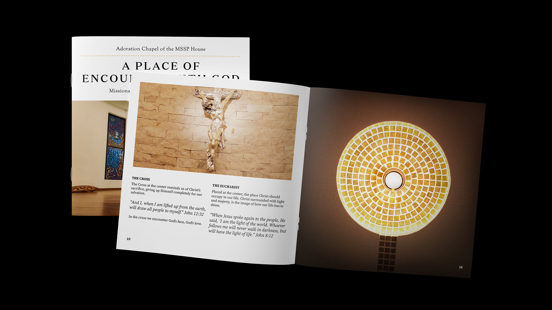
The logo was built from three symbolic elements: a boat representing journey and purpose, a Christ figure symbolizing divine presence, and a ribbon that evokes unity and togetherness. These were combined into a geometric mark that feels sacred yet contemporary. The typography and layout followed suit, balancing serif and sans-serif styles with circular motifs to reflect connection and eternity. A palette of deep blues, soft teals, and warm neutrals was chosen to convey calm, trust, and spiritual depth across all applications.
To support outreach and engagement, we developed a modular system of graphics and messaging pillars. Phrases like “Find Your Family” and “Celebrate at the Table” were paired with evocative imagery and layered text to create emotional impact. The final brand system is versatile and deeply meaningful, allowing Holy Family Rockford to communicate with clarity and compassion across ministries, events, and digital platforms.